



Learn how to match your phone case to your iPhone color with the best color combinations, stylish prints, finishes, and tips for every iPhone 18 Pro shade.

Apple’s color choices get more attention every year, and buyers respond to them. When Consumer Intelligence Research Partners asked iPhone 14 Pro owners which finish they had picked, two-thirds had gone for Deep Purple or Gold instead of the safer neutrals. Trend forecaster WGSN puts color even higher on the list of buying factors, noting that 70 to 90% of consumers say color alone is a primary reason for buying a product.
Then most of us put that carefully chosen phone straight into a case. The color doesn’t disappear, though. It still shows around the camera, along the edges and at the buttons, and it either works with the case or fights it. This guide covers each iPhone 18 Pro finish and the case colors, prints and finishes that suit it, plus a few rules that apply to any phone.
Which Parts of Your iPhone Color Show Through a Case?
Before picking a color, it helps to know where the phone stays visible. On most cases you will still see:
• The camera plateau: the raised camera area is the largest patch of phone color left on show, and it sits right in the middle of the case design.
• The frame edges: depending on the case, a thin line of aluminum can appear around the screen and at the cut-outs.
• The buttons and ports: small, but they catch the eye when the colors clash.
So matching a case to your phone color is mostly about what sits next to the camera. A case that looks great on its own can look off once a burgundy or icy blue camera plateau sits in the middle of it.
What Colors Does the iPhone 18 Pro Come In?
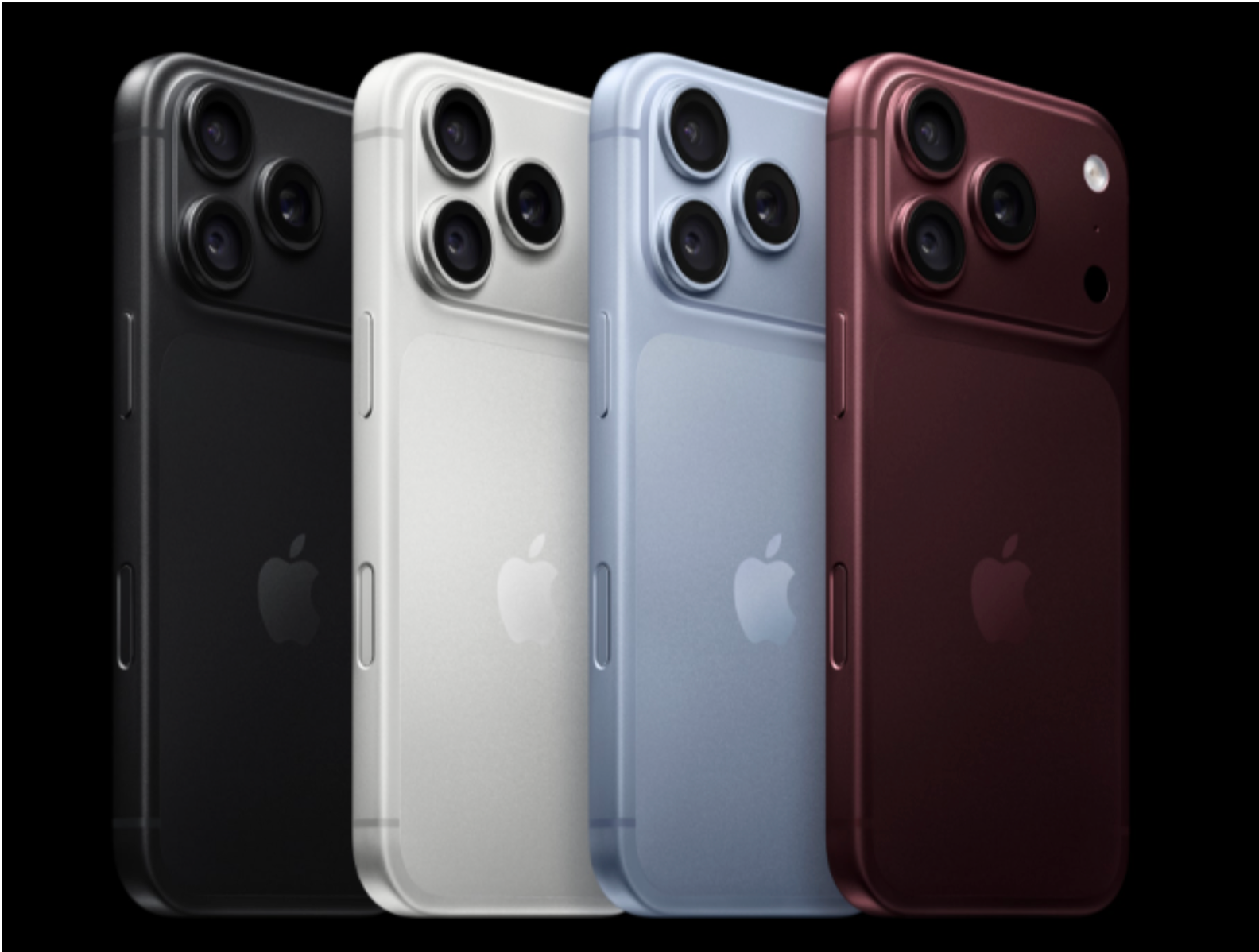
The iPhone 18 Pro and iPhone 18 Pro Max share the same four finishes, each with color-matched glass and an aluminum frame, according to MacRumors and Beebom:
• Burgundy: a deep, wine-like red with purple undertones, and this year’s headline color.
• Glacier: a pale, icy light blue.
• Black: a deep neutral, back after a year without one on the Pro models.
• Silver: a bright, polished shade that sits between white and grey.
Each one leans warm or cool, light or dark, and that is what decides which cases suit it.
7 Ways to Match Your Phone Case to Your iPhone Color
1. Choose a Tonal Case for a Burgundy iPhone
Burgundy is the easiest color to build on, because it already has a strong personality. A tonal case, one that stays in the same red and pink family, makes the camera plateau look like part of the design instead of an interruption. Among BURGA iPhone 18 Pro cases, the Pomegranate design, with pink and red stripes, shows how this works: the stripes pick up the wine shade without trying to copy it.
Stay away from bright orange-reds and cool, bubblegum pinks. They sit too close to burgundy to contrast and too far from it to match, which is the combination that looks accidental.
2. Pair a Burgundy iPhone With Warm Neutral Cases
If tonal feels like too much red, go the other way and let the burgundy stand out against something quiet. Cream, beige, camel and soft caramel all bring out its warmth, and a soft floral on a beige background works just as well as a solid. The neutral calms things down, and the burgundy camera area reads as a deliberate accent.
3. Pick a Soft Blue Print for a Glacier iPhone
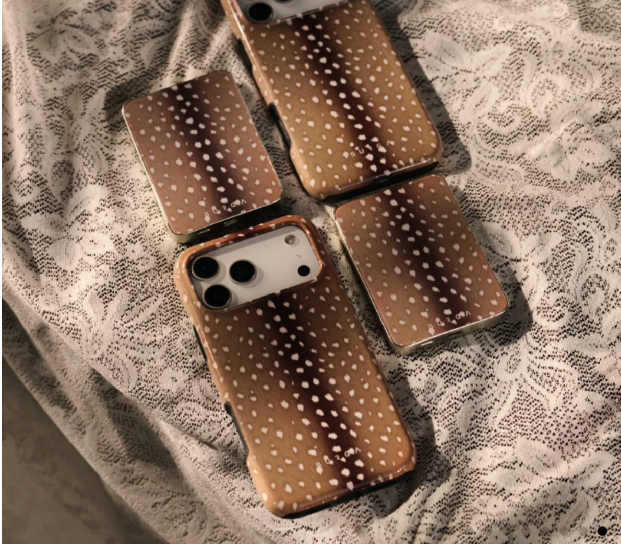
Glacier is pale and cool, so solid dark cases can swallow it and bright warm colors can make it look washed out. The safest route is a print that already contains a soft blue. Stripes that mix blue with a warm brown work especially well: the blue ties into the phone, and the brown keeps the overall look from turning cold.
Soft greys, white, lavender and pale denim are reliable solid choices for Glacier. If you want contrast, a warm sand or tan works better than orange or red.
4. Use Bold or Black-and-White Prints on a Black iPhone
Black goes with almost everything, which makes it the color where your case can do the most work. Bright colors look more saturated next to it, and graphic prints look sharper. Black-and-white patterns, such as a cow print, are the most natural fit, because the camera plateau simply becomes another dark shape in the design.
Animal prints follow the same logic. In a piece about her style at 50, one writer compares her leopard-print iPhone Duo case to a sequin jacket for her pocket, and that approach suits a Black phone well: when the phone itself is neutral, the case can be the boldest thing you carry.
The only thing to watch with Black is very dark, low-contrast prints. A navy or charcoal case on a black phone can look muddy rather than sleek.

5. Keep Cases Light, Clean or Mirrored for a Silver iPhone
Silver is bright, cool and slightly reflective, so it suits cases with the same clean feel. White and grey marble, soft neutrals and gentle florals all sit comfortably beside it. A mirror-back case echoes the polish of the aluminum directly.
Because Silver is close to neutral, it also handles bold prints well. If you choose one, keep the colors on the cool side so the camera area doesn’t look grey and flat against warm tones.
6. Match the Case Finish to Your iPhone’s Finish
Apple’s color-matched glass and aluminum give each iPhone 18 Pro a specific feel, and your case finish can work with it. Glossy and mirror cases suit the shine of Silver and the depth of Black. Matte cases soften Burgundy and Glacier and make them look more muted and grown-up. Soft, quilted cases add warmth to any of the four.
7. Use Color Contrast on Purpose
Contrast works when it is clearly intentional. A simple rule: the case should share either the temperature or the lightness of your phone. A pale Glacier phone can take a pale warm case, because the lightness matches. A Black phone can take almost any saturated color, because the depth balances it. When a case differs from the phone in both temperature and lightness, the camera area tends to look like a mistake.
Which Phone Case Type Suits Each iPhone 18 Pro Color?
The construction of a case changes its finish and how much of the phone shows, so it is worth choosing alongside the color:
• Slim matte cases soften Burgundy and Glacier.
• Mirror-back cases are a natural match for Silver and Black.
• Dual-layer cases with raised bezels suit anyone who wants more protection around the camera and screen.
• Quilted cases add warmth to any of the four colors.
As one example, BURGA iPhone 18 Pro cases come in all four of these constructions: Tough, Elite, Elite Mirror and Puffy Elite. Tough, Elite and Elite Mirror are MagSafe compatible; Puffy Elite is not. Whichever type you choose, buy the case listed for your exact model. The iPhone 18 Pro and iPhone 18 Pro Max are different sizes, and the camera cut-out needs to line up properly to frame that patch of phone color cleanly.
How to Coordinate Your Wallpaper and Accessories With Your iPhone Color
Your case is only one part of how the phone looks. Apple has released official wallpapers for each iPhone 18 Pro color, and setting the one that matches your finish ties the screen to the camera area you see every time you flip the phone over.
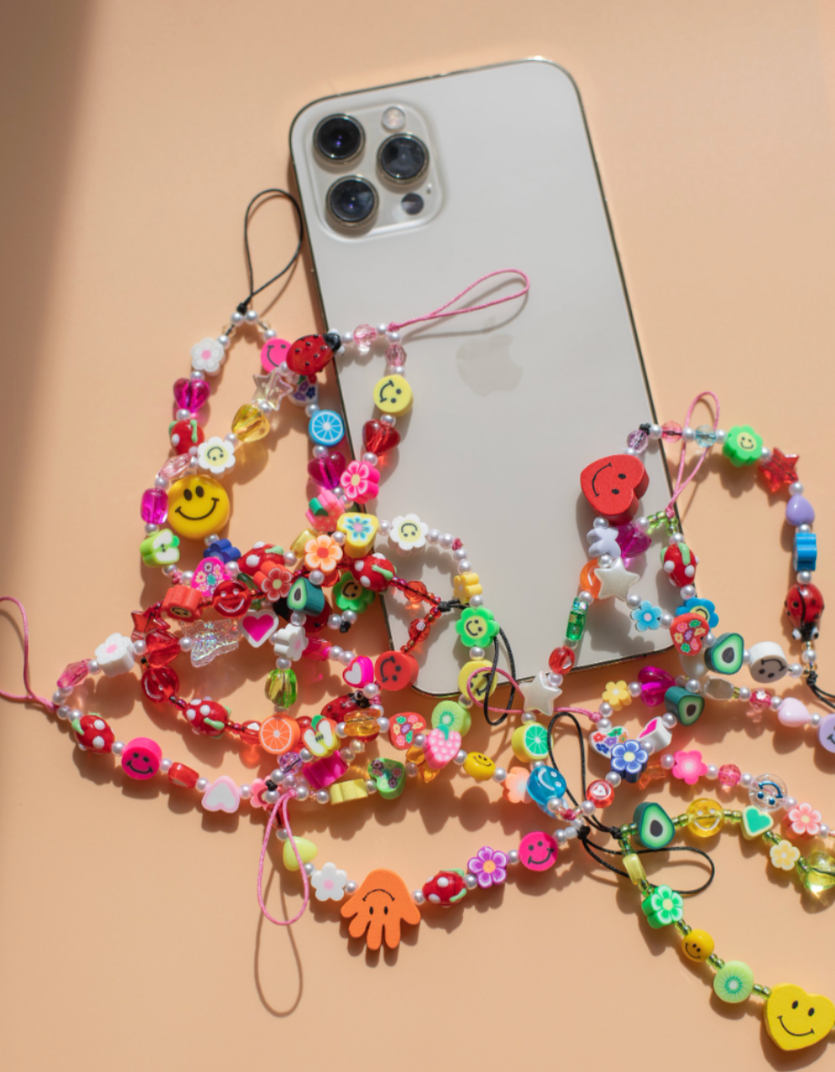
Accessories count too. A phone case and earbud case in the same print look like a set without much effort. If you use a MagSafe power bank or wallet, choose one in a shade from your case or your phone so it doesn’t add a third unrelated color.
iPhone 18 Pro Color and Case Pairing Chart
iPhone 18 Pro color | Case colors that work | Prints to try | Best avoided |
Burgundy | Pink, red, cream, beige, camel | Tonal stripes, soft florals on beige | Orange-red, bubblegum pink |
Glacier | Soft grey, white, lavender, pale denim, sand | Prints with soft blue, warm-and-cool stripes | Orange, bright red, very dark solids |
Black | Almost anything, especially bright colors | Black-and-white graphics, animal prints | Navy, charcoal, very dark prints |
Silver | White, grey, cool pastels, mirror finishes | Marble, gentle florals, cool-toned prints | Heavy warm browns and oranges |
Common Mistakes When Matching a Case to Your iPhone Color
The most common one is choosing a case in nearly the same color as the phone but not quite. A light blue case that is a few shades off from Glacier draws attention to the difference instead of hiding it. Go clearly tonal with a print, or clearly contrasting.
Another is forgetting the camera plateau entirely and choosing a case from a product photo of the case alone. Picture the camera area in your phone’s color sitting in the middle of the design before you buy. It is also worth thinking about how long you keep a case. Bold trend colors can feel dated in a few months, so if you only plan to buy one case, a print with your phone’s color plus a neutral will stay easy to live with.
Frequently Asked Questions
Should my phone case be the same color as my iPhone?
Not exactly. A case a few shades off from your phone highlights the difference. A tonal print that includes your phone’s color, or a clear contrast that shares its temperature or lightness, looks more deliberate.
What color case goes best with a Burgundy iPhone 18 Pro?
Reds and pinks in a tonal print, or warm neutrals such as cream, beige and camel. Avoid orange-reds and bubblegum pinks.
What color case goes best with a Glacier iPhone 18 Pro?
Soft greys, white, lavender and pale denim, or a print that contains a soft blue. For contrast, warm sand or tan works better than bright warm colors.
Does a Black iPhone go with any case?
Almost. Bright colors, black-and-white graphics and animal prints all work well. Very dark, low-contrast cases such as navy or charcoal are the main ones to skip.
Final Thoughts
Matching a case to your iPhone color starts with knowing what still shows: the camera plateau, the edges and the buttons. From there, go tonal or warm-neutral with Burgundy, pick up Glacier’s blue in a soft print, treat Black as a canvas for bolder designs, and keep Silver light, clean or mirrored. Match the case finish to the feel of your phone, use contrast only when it shares temperature or lightness, and choose a construction that fits how you charge and carry the phone. Finish with a matching wallpaper and accessories, and the whole setup will look planned from the screen to the camera.
Related Posts
- Top Advertising Agencies in 2027: Best Global Firms & How to Choose
- How Mobile Apps Are Revolutionizing the Real Estate Industry
- How Data Annotation for AI in Energy Improves Renewable Energy Monitoring
- How-To guide: Set up domain and hosting for your Magento 2 store
- How to Match Your Phone Case to Your iPhone Color
- The Best Medical Virtual Receptionists and Answering Services (2027 Guide)